
Intro to Responsive Web Design Mobile-Friendly Websites

Creating a website that works beautifully on every screen is a must in today’s digital world. With millions of users browsing on smartphones, tablets, laptops, and desktops, website owners need to make sure their pages adapt smoothly to all devices. This is where Responsive Web Design becomes powerful. It helps websites adjust layout, content, and visuals depending on the size of the screen. In this guide, you will learn how Responsive Web Design works, why it matters, and how you can apply it to build mobile friendly websites that give your readers the best possible experience.
This long and friendly guide is designed especially for beginners, content creators, business owners, and aspiring Filipino web developers. We will walk through the foundations, techniques, tools, best practices, and simple examples you can use right away so you can build confidence, understand core concepts, improve your skills, and create responsive projects with greater ease.
Let us dive in and make your website future ready by exploring essential techniques, understanding modern design practices, applying practical strategies, improving usability, enhancing performance, and building responsive layouts that adapt smoothly across all devices for long term success.
What Is Responsive Web Design
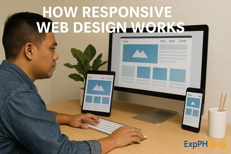
Responsive Web Design refers to a design approach that allows websites to automatically adjust and look good on any screen size. Instead of creating separate versions for desktop and mobile, you build one flexible layout that changes smoothly based on the device. The main idea behind Responsive Web Design is simple. Your website should remain readable, visually appealing, and easy to navigate whether the visitor is using a phone, tablet, or large desktop monitor.
The charm of Responsive Web Design comes from using flexible layouts, responsive images, and CSS media queries. These three elements help your website respond naturally to different devices. As more users rely on mobile browsing, websites that ignore this approach risk losing traffic and rankings.
Google also prioritizes mobile friendly websites, which makes Responsive Web Design even more valuable for SEO because it improves rankings, enhances user engagement, supports faster loading times, strengthens overall visibility, and helps your website remain competitive across many different search environments.
Why Responsive Web Design Matters Today
Learning Responsive Web Design is no longer optional. It plays a major role in user experience, search visibility, and website performance. Here are the key reasons why it matters today, especially in the Philippines where mobile internet usage continues to rise and shapes digital behavior nationwide.
Improved User Experience
Visitors love websites that are easy to use. Responsive Web Design ensures that text is readable, images are properly scaled, and buttons are easy to tap. When users enjoy their browsing experience, they stay longer, explore more pages, and are more likely to return because everything feels intuitive.
Better SEO Performance
Search engines reward mobile friendly pages. With Google’s mobile first indexing, the mobile version of your site is considered your primary version. When you use Responsive Web Design, you help Google understand your content better and index your pages more accurately. This improves ranking potential and overall visibility.
Higher Conversion Rates
A smoother browsing experience leads to higher conversions. Whether you want users to subscribe, buy a product, join a webinar, or read more articles, Responsive Web Design helps by removing barriers that frustrate them. A visitor who interacts comfortably is more likely to take the next step.
Reduced Maintenance
Before Responsive Web Design, developers created separate desktop and mobile websites. Maintaining two versions meant double the work. With a responsive approach, you only update one website, which saves you time, effort, and money and greatly simplifies long term development tasks.
How Responsive Web Design Works
To understand Responsive Web Design, you need to know the techniques that make it possible. These include fluid grids, flexible images, and media queries which work together seamlessly to create adaptable layouts, improve usability, and ensure pages display correctly across different screen sizes.
Fluid Grid Systems
A fluid grid uses percentages instead of fixed pixel widths. This lets your layout stretch or shrink depending on screen size. Instead of saying a column is 300 pixels wide, you define it as a percentage of the container ensuring flexible structure and consistent alignment across various modern devices.
This makes layouts flexible and ready for various device sizes.
Flexible and Responsive Images
Images that scale with the screen help maintain visual balance. When images are too large for small screens, users are forced to scroll sideways or zoom out, which damages the experience. Responsive Web Design solves this through CSS rules like:
img {
    max-width: 100 percent;
    height: auto;
}
This ensures images shrink when needed so they maintain proper proportions, prevent layout overflow, improve readability, enhance loading performance, support cleaner visual structure, and provide users with a smoother browsing experience across many different devices and screen sizes.
CSS Media Queries
Media queries are the heart of Responsive Web Design. They apply specific styles based on screen size. For example, if you want to change the layout for screens smaller than 768 pixels, you use a media query to ensure proper scaling and maintain consistent visual presentation across different devices.
A simple example looks like this:
@media screen and (max-width: 768px) {
    .content {
        flex-direction: column;
    }
}
Media queries allow you to tailor the layout for mobile, tablet, and desktop views so your design adapts properly, improves readability, enhances usability, supports flexible structures, maintains visual consistency, and ensures users enjoy a seamless experience across different screen sizes.
Core Principles of Responsive Web Design
Now that you know the foundations, let us explore the core principles of Responsive Web Design. These principles guide developers and designers in building adaptable and visually consistent interfaces that function well across devices and support stronger, more efficient modern web development practices.
Design for the Smallest Screen First
This is known as the mobile first approach. You start by designing for mobile screens, then gradually enhance the layout for larger devices. This method improves loading performance, simplifies layout decisions, and ensures your website works great on phones in many real situations.
Use Fluid Layouts
Avoid fixed widths. Fluid layouts help your website respond to different environments naturally. Once you embrace percentages, you give your design flexibility and improve overall viewing comfort which leads to smoother user experiences across devices and supports better long term design consistency.
Optimize Media and Typography
Large images slow websites down, especially on mobile. Compress images, use next generation formats, and apply responsive typography. Responsive Web Design makes sure text remains readable while adapting to screen proportions resulting in clearer content presentation and improved user satisfaction across devices.
Keep Navigation Simple
Navigation should be clear and easy to use on any device. Hamburger menus, collapsible lists, and simplified links help mobile users move around quickly. When navigation is smooth, overall usability improves which encourages longer engagement and supports a more enjoyable browsing experience for visitors.

Responsive Web Design and Mobile Friendly Websites
Modern users browse mainly through mobile devices. This is why mobile friendliness is a critical part of Responsive Web Design. Let us understand how both concepts work together and strengthen your online presence by improving usability, boosting engagement, and supporting consistent performance across devices.
Touch Friendly Design
Mobile users rely on touch. This means buttons must be large enough to tap accurately, links should have enough spacing, and there should be no overlapping elements. A touch friendly design improves accessibility and navigation flow helping create smoother interactions and more satisfying user experiences overall.
Fast Loading Speed
Slow websites drive visitors away. Since mobile users often rely on mobile data, performance matters even more. Techniques like image compression, caching, and clean coding help ensure your Responsive Web Design efforts lead to a fast loading mobile site for users in every location.
Viewport Meta Tag
This simple HTML tag helps the browser understand how to scale your website so elements display correctly, maintain proper proportions, improve readability, enhance usability, prevent layout issues, and ensure your pages adapt smoothly across various mobile screen sizes.
<meta name="viewport" content="width=device-width, initial-scale=1.0">
Without it, your page may appear zoomed out or broken on mobile screens which can cause layout distortions, hinder readability, force unnecessary zooming, create navigation difficulties, frustrate visitors, reduce engagement, and negatively impact the overall user experience across mobile devices.
Best Practices for Responsive Web Design
Here are the most important guidelines you should follow when building a website with Responsive Web Design to ensure stronger performance, improve usability, maintain visual consistency, support mobile users effectively, and create flexible layouts that adapt smoothly across multiple screen sizes.
Use Breakpoints Wisely
Breakpoints are screen sizes where your design changes layout. Common breakpoints include:
- 320px for small smartphones
- 768px for tablets
- 1024px for laptops1200px for large desktops
Use breakpoints based on your audience. Analyze device usage in Google Analytics to choose the right sizes so your layout adapts appropriately, supports user needs, improves usability, enhances visual consistency, and delivers optimized viewing experiences across many devices commonly used by your visitors.
Avoid Overlapping Elements
Test your layout on different devices to make sure elements do not overlap. Overlapping images, text, or icons ruin the user experience because they create confusion, hinder readability, disrupt navigation flow, reduce visual clarity, and make your website feel unprofessional to visitors across multiple screen sizes.
Test on Real Devices
Emulators are helpful, but real devices give you clearer insight. Try browsing your site on different phones and tablets to see how it behaves so you can detect hidden issues, understand real user interactions, evaluate performance accurately, and ensure consistent experiences across all devices.
Keep Forms Mobile Friendly
Forms need bigger input fields, simple labels, and auto fill support. Since forms play a major role in conversions, applying Responsive Web Design to them is essential because it improves usability, reduces errors, and encourages visitors to complete submissions more confidently across all devices.
Use Scalable Icons
SVG icons are perfect for Responsive Web Design because they scale without losing quality which ensures crisp visuals, improves performance, supports flexible layouts, enhances accessibility, and provides designers with reliable graphics that display consistently across many different screen sizes.

Common Mistakes to Avoid in Responsive Web Design
Even experienced developers make mistakes. Avoid the following to maintain a smooth and consistent user experience because preventing common errors improves usability, strengthens design quality, enhances performance across devices, and helps ensure visitors enjoy reliable interactions every time.
Using Fixed Widths
Fixed widths break layouts on small screens. Rely on flexible units to maintain responsiveness so your design adapts naturally, avoids unnecessary scrolling, improves usability, enhances visual balance, and provides consistent viewing experiences across many different devices and screen sizes.
Ignoring Image Optimization
Large images slow down mobile users. Compress images before uploading and use responsive attributes This improves loading speed, reduces bandwidth usage, enhances performance, supports smoother browsing, and ensures users experience faster, more reliable pages on devices.
Poor Font Choices
Fonts must remain readable at all sizes. Avoid fonts that become too thin or too small on mobile because they decrease legibility, frustrate users, weaken accessibility standards, disrupt visual balance, and make it harder for visitors to comfortably browse and understand your content.
Not Testing Enough
Skipping testing is one of the biggest mistakes. Even if your design looks perfect on a desktop, it may not behave well on mobile screens because real devices reveal hidden issues, highlight usability problems, expose layout inconsistencies, and show performance limitations that desktop previews often fail to display.
Tools for Responsive Web Design
Thankfully, there are many tools that assist developers in creating responsive websites. Here are the most useful ones that improve workflow efficiency, simplify debugging tasks, enhance layout flexibility, support better testing processes, and guide developers toward producing high quality responsive designs.
Google Mobile Friendly Test
This tool evaluates whether your website is optimized for mobile devices. It provides suggestions you can use to improve your Responsive Web Design by recommending adjustments that enhance performance, strengthen layout responsiveness, and improve user experience across many different screen sizes.
Chrome DevTools
You can preview your website on multiple screen sizes using the responsive design mode in Chrome DevTools. It helps you test breakpoints quickly so you can identify layout problems early, refine visual elements, adjust spacing accurately, and ensure consistent performance across many different devices.
Bootstrap and Tailwind CSS
These CSS frameworks offer prebuilt responsive components that make designing easier. They follow the principles of Responsive Web Design, which means you can build layouts faster and more efficiently while maintaining consistency, reducing errors, and supporting better long term development practices.
Figma and Adobe XD
These design tools help you create responsive prototypes. You can preview how your layout adjusts on phone, tablet, and desktop sizes which allows better planning, improves accuracy, highlights layout issues early, and helps designers build more reliable interfaces for various devices.
Responsive Web Design for Beginners
If you are just starting, here is a simple roadmap you can follow to learn Responsive Web Design step by step, Start by learning core concepts, practice small layouts daily, explore tutorials, test designs frequently, and build confidence with responsive techniques, and collaborate with peers online.
Start with Mobile First
Build a layout for small screens before expanding upward. This makes the design clean and efficient because it simplifies structure, improves performance, reduces unnecessary elements, enhances clarity, and guides developers toward creating layouts that adapt naturally across various screen sizes.
Learn Basic CSS
Study flexbox, grid, media queries, percentages, paddings, and margins. These are the building blocks of Responsive Web Design because they define structure, control spacing, improve adaptability, support layout decisions, and help ensure websites display correctly across different screen sizes.
Practice Using Real Projects
You will learn faster by building something simple. Try creating a personal profile website or a simple landing page to practice essential skills, understand layout behavior, gain real experience, improve confidence, and develop stronger problem solving abilities through consistent hands on learning.
Check Your Results Often
Refresh your design on different screen sizes to understand how your layout responds because this process reveals hidden issues, improves visual consistency, guides necessary adjustments, strengthens usability, and ensures every visitor experiences your website comfortably across various devices.

How Responsive Web Design Impacts SEO
Search engines love responsive websites. Here is how Responsive Web Design boosts SEO performance by improving user engagement, strengthening mobile visibility, reducing technical issues, enhancing crawl efficiency, and supporting consistent page experiences across all viewing devices online.
Better Crawl Efficiency
Search engines can crawl your site more easily since you only have one version of each page which simplifies indexing processes, reduces duplicated content issues, improves overall accuracy in search results, and ensures your website performs efficiently across systems online.
Improved User Metrics
Metrics like bounce rate, time on site, and page views per session improve when the user experience is smooth because satisfied visitors stay longer, explore additional pages, interact more confidently, trust your content, and return regularly for valuable information they enjoy consistently.
Higher Mobile Rankings
Google prioritizes mobile friendly pages. When your design follows the rules of Responsive Web Design, your mobile ranking potential increases helping your site attract more traffic, improve user experience, and achieve stronger long term performance across search results.
Lower Duplicate Content Issues
Since you only maintain one responsive version, you avoid problems caused by separate mobile sites which simplifies management, improves consistency, reduces developer workload, enhances SEO performance, and ensures users enjoy reliable functionality across all devices.
Future of Responsive Web Design
As technology evolves, Responsive Web Design continues to grow. Here are trends shaping its future that influence development practices, improve user experiences, guide modern design approaches, and support smarter solutions for rapidly changing digital environments.
Advanced CSS Features
CSS Grid, container queries, and clamp functions are becoming standard. These give developers more flexible ways to build responsive layouts that adapt efficiently across devices, improve workflow consistency, and support modern design techniques for better overall user experience.
Smarter Breakpoints
Future frameworks may use AI to automatically detect ideal breakpoints based on content structure to create smoother layouts, enhance responsiveness across devices, improve performance, and assist developers with smarter automated decisions during design workflows.
More Focus on Performance
Since mobile networks vary in speed, developers are paying more attention to lightweight design to ensure faster loading times, smoother interactions, improved accessibility, and consistent performance across many different devices under varying world conditions.
Integration with Mobile Apps
Some websites behave like mobile apps through features like offline access and push notifications. Responsive layouts help bridge both worlds. This approach improves engagement, enhances performance across devices, and delivers smoother user experiences for all users everywhere.
Conclusion
Responsive Web Design is one of the most important skills in modern web development. Whether you are a blogger, entrepreneur, or future web developer, understanding this approach will make your online presence stronger, more professional, and more competitive. With more users browsing on mobile devices, your website needs to adapt beautifully to different screen sizes. Responsive Web Design helps you achieve exactly that.
By using flexible layouts, media queries, optimized images, and a user centered mindset, you can create a website that loads fast, feels comfortable, and encourages visitors to explore more. This guide gives you the foundation, and with practice, you will be able to build responsive and mobile friendly websites that stand out in the digital world.
Learn more from the extended list below.
- How to Set Up a Local Development Environment with XAMPP and VS Code
- How to Create Your First Web Page from Scratch Step by Step
- JavaScript DOM Manipulation Make Webpages Come Alive
- CSS Layout Mastery Made Simple with Flexbox and Grid
- How to Use Git and GitHub for Beginners
For validated reference data, click the link below.
- Mozilla Developer Network (MDN) Responsive Design Guide
- Google Developers: Responsive Web Design Basics
- W3C CSS Media Queries Documentation

FAQs About Intro to Responsive Web Design Mobile-Friendly Websites
What is Responsive Web Design in simple terms
Responsive Web Design is a method that allows websites to automatically adjust layouts, images, and content to fit different screen sizes, creating smoother and more enjoyable user experiences.
Why is Responsive Web Design important for mobile users
Responsive Web Design ensures websites remain readable, functional, and visually balanced on phones or tablets, helping users browse comfortably while improving engagement, user satisfaction, and search engine performance.
How does a responsive website improve SEO performance
A responsive website improves SEO by offering faster loading, better readability, and mobile friendliness, helping search engines understand content clearly and rewarding websites with higher rankings.
What are the main elements used in Responsive Web Design
Responsive Web Design uses fluid grids, flexible images, and CSS media queries to create layouts that adjust automatically across devices, improving user experience and overall website usability.
What is a mobile first approach in responsive design
A mobile first approach begins by designing layouts for smaller screens first, then expanding features for larger devices, ensuring efficiency, improved performance, and stronger user experience across platforms.
How do media queries work in Responsive Web Design
Media queries apply different CSS rules depending on screen size, allowing websites to adjust styles, layouts, and content based on device dimensions for better responsiveness.
How can responsive design improve website conversions
Responsive design enhances conversions by making content easier to read, navigation simpler, and interactions smoother on all devices, increasing trust, user comfort, and overall engagement.
What common mistakes should be avoided in Responsive Web Design
Common mistakes include using fixed widths, uncompressed images, overcrowded layouts, and poor testing. Avoiding these issues creates smoother experiences for all users and devices.
What tools help beginners practice Responsive Web Design
Helpful tools include Chrome DevTools, Bootstrap, Tailwind CSS, Figma, Adobe XD, and online testing platforms, which guide beginners in creating flexible, responsive, and visually consistent layouts.
How often should a website be tested for responsiveness
A website should be tested regularly, especially after updates or new content, to ensure layouts, images, and navigation still function properly across different devices and screen sizes.
Test your knowledge, learn faster, and enjoy growing your skills inside the ExpPH Blog Learning Hub.
Results


#1. What is Responsive Web Design
#2. What does a fluid grid use
#3. Why is mobile first important
#4. What helps scale images
#5. What do media queries change
#6. What improves readability
#7. What boosts SEO results
#8. What helps smooth navigation
#9. What ensures usability
#10. What should developers test
Your growth means a lot, and we are excited to be part of your online learning journey.
Do not forget to comment your quiz experience with us so we can continue improving our lessons for you.

A Filipino web developer with a background in Computer Engineering. Founder of ExpPH Blog and ExpPH Business Guide, creating practical content on OFW guidance, business, finance, freelancing, travel, and lifestyle. Passionate about helping Filipinos grow, he shares insights that educate, empower, and inspire readers nationwide.


Pingback: 10 Webdesign Mistakes Beginners Should Avoid in HTML and CSS